## 1.
**[Preview and Design](#preview)**
## 2.
[**How to create**](#creation)
## 3.
[**How to translate**](/site-configuration/edit-translations "Edit translations")
**Warning**
Showcase Card is a specifc media designed to bring additional information,
and redirect to another content if needed.
It's restricted to **Business Case**, **Market** and **Solution** templates
---
## Preview
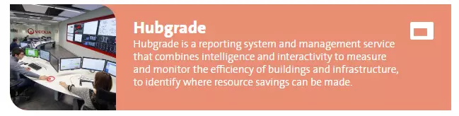
Showcase card media example, default view
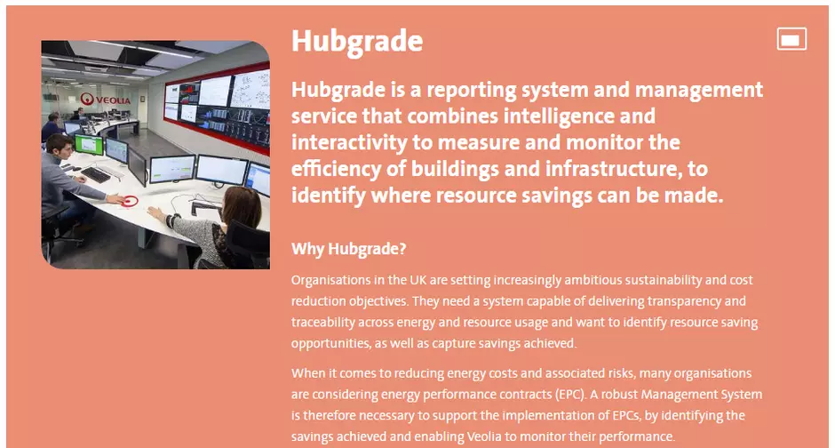
Showcase card media example, display on hover
## Information architecture
Showcase cards media allows to display a big amount of data in a compacts block with an image and short introduction preview.
## Design
Showcase card component can be added only to the **[Showcase Cards component](/components/showcase-cards-component "Showcase cards component")**
Long description is displaying on mouse over.
---
## How to create it
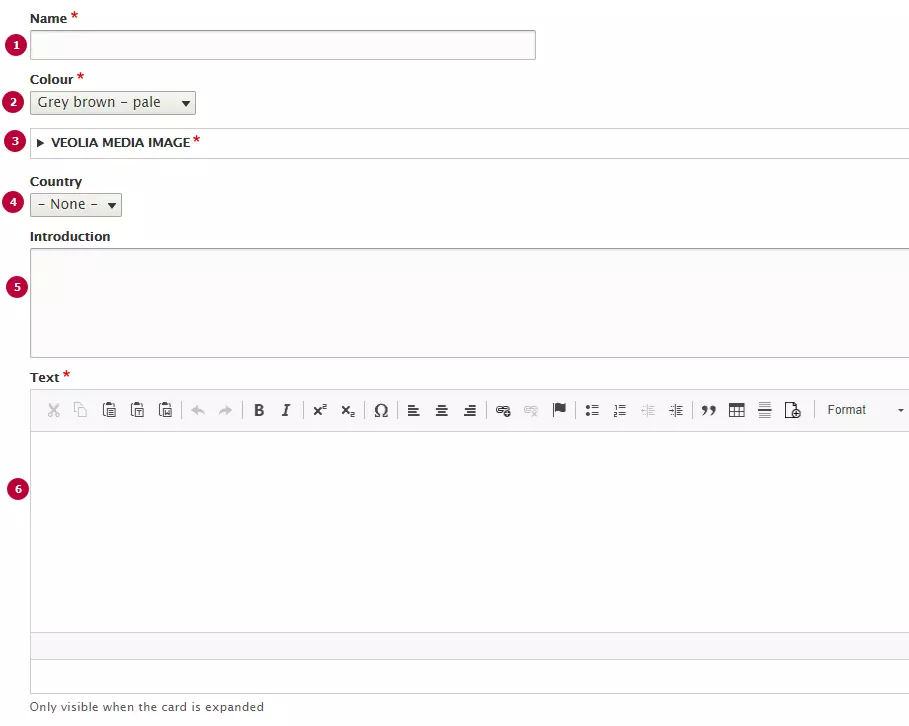
| Field | Description |
|---|---|
| 1 - Name | Used only in the backoffice |
| 2 - Colour | Colour of the Card. Can use any of Veolia color |
| 3 - Image | Thumbnail image. Recommended image dimension is 260x260px. |
| 4 - Country | Options from Country taxonomy. Name of country displays as laybel of the card if it set |
| 5 - Introduction | Introduction text, displayes on Showcase card preview. Becomes bolder on hover |
| 6 - Text | Long text of showcase card. Can include text styles and headers |