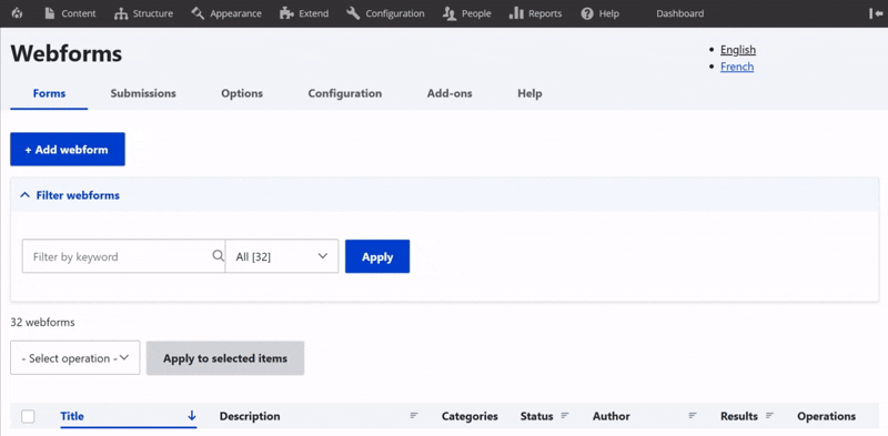
Access webforms
Webform structure
Webform elements
Webform conditions
View and test menus
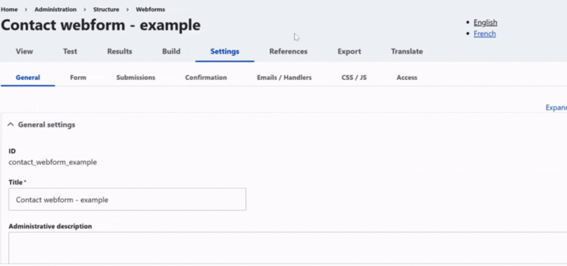
General settings
Config' settings
Handlers settings
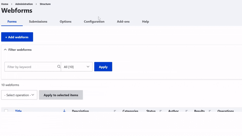
To access, first click on Structure in the main menu.
Then, go to the Webforms section.
From there, you access page with all webforms already available on the site.
Add a webform
First, click on the Add Webform button.
Then, enter the Name to name your form used internally in the back office.
Next, add a short Description to clarify the form’s purpose.
Finally, set the Status to activate the form or keep it for later use.
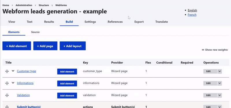
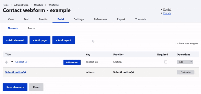
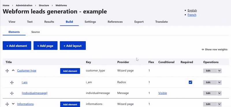
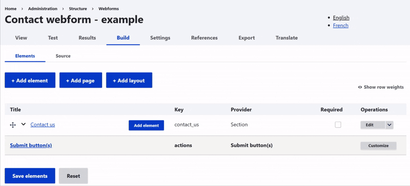
Building a structure allows you to organize the webform and makes it easier to manage in the back office.
You can use pages to turn it into steps. Sections help you group related information by theme.
You can also just add one element after another to build your form step by step.
Hint: Drag and drop is available when in Build page, making you able to change position for each field (even changing a field from one section to another)
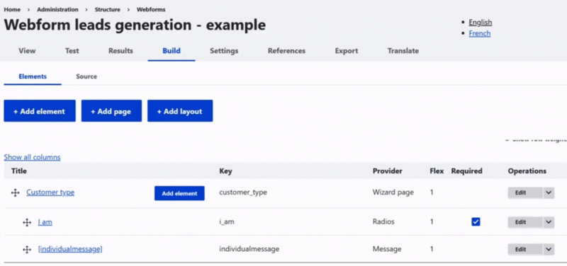
Add elements to webform structure
Once the structure is in place, the next step is to add elements to your webform.
Add elements and you can view the list of items and preview their layout in the front office using the 'Show Preview' button.
Then, within each section, give them a name, customize them if needed, and don’t forget to save.
To edit an element, just click on it. The editing panel will open automatically.
First, you can change the name that appears in the form.
It's also possible to enable multiple values, if the user needs to add more than one answer.
Element description / Help / More zone
Then, you can add a description, extra information, or even a link if needed.
You can also include a help message to guide the user on how to fill out the field.
The '*' character can appear next to the field, showing a tooltip when hovered over, if necessary.
Form display zone
In the display section, you decide how the field appears in the form.
For example, the title can be shown before, after, inline, or hidden. The description works the same way.
You can also add default text inside the field, called a placeholder. There’s also an option to enable autofill from the browser.
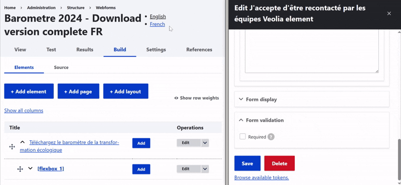
Form validation zone
Finally, you can set validation rules.
A field can be marked as required, which is the most commonly used option and is recommended.
When a user submits the form without filling out this field, a custom error message can be displayed.

All elements
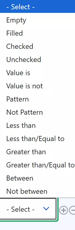
After setting the general options, the Edit panel lets you create behaviors, manage settings, and control access.
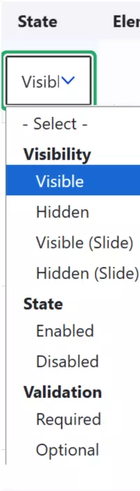
To configure a behavior, first choose the state of the field, like visible or hidden.
Then, define the condition that triggers this state.
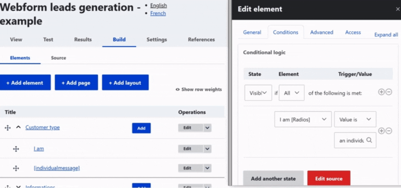
You can add or remove a condition using the '+' or 'x' buttons.
If needed, you can also add another behavior for the same field. When you delete a behavior, all its conditions will be removed as well.
These features are considered advanced, so use them carefully.
States
Condition restricting
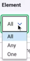
Field on which condition is applied
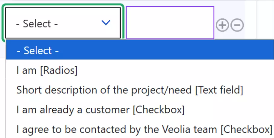
Condition describing
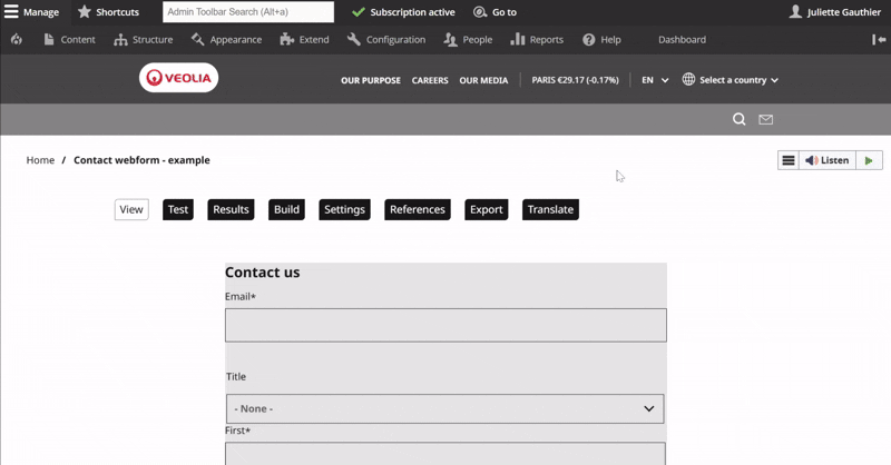
Once your webform is created in Drupal, you can use the View tab to preview the full form and see how it will appear to users.
The Test tab allows you to try out the form, helping you identify any issues and make adjustments before publishing.
Finally, the Build tab takes you back to the form configuration page, where you can add, edit, or remove elements of the webform.
The General settings tab lets you set a name (back office only).
Enable Use Ajax if your Webform has multiple pages to keep users on the current section instead of restarting the form.
You can edit the GDPR legal notice shown on the front end and automatically added when creating a Webform so you can translate and customize it. If you're not using the default legal notice, remember to update the text and link accordingly.
Finally, click Save to apply your changes.
Page
The page reloads and a thank you message is displayed.
Inline
The form is hidden and a thank you message appears in its place on the same page.
Message
The page reloads and the confirmation message is shown at the top, with a green background.
Modal
A pop-in (modal) appears with the confirmation message, without leaving the page.
URL
Redirects the user to a specified internal or external URL after submission.
URL with message
Redirects to a specific internal URL and displays the confirmation message on that page.
Note: The message won’t appear if the URL is external.
None
The page reloads without showing any confirmation message.
⚠️ This option is not recommended, as it gives no feedback to the user.
The Email / Handlers tab is essential for ensuring submitted data is processed correctly and reaches the right people.
To avoid delays, always make sure at least one recipient email is configured, so requests can be treated as soon as possible.
To add a recipient, click Add email, enter a title, then in the Send to section, choose Custom and add the recipient’s email. You can customize the email content in the Message section.
Translate the webform
To translate, click on Translate on the right-hand side of the webform line, just below the Build option in the action menu.
Then, click Add next to the desired language.
The edit page allows you to translate the title (only in the back office) as well as all text elements visible on the front end.
Hint: Please translate only the words and do not change any characters or structure to ensure the form works correctly. If any special rules, conditions, or handlers are in place, guidance will be provided to help you translate or adapt the associated texts accurately.