Preview
Information architecture
This component is dedicated to bring additional level of layout for pages by adding the ability of using an image as a background behind usual components.
Design
Container is designed in two parts. First for background setting, then Second with usual components choice and setting.
Typical usage and example
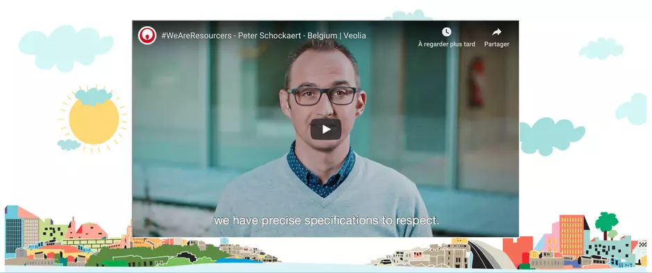
To be used for: any page where enhanced graphic layout is needed. Resourcer stories for example
See an example on https://www.veolia.com/en/careers/our-mission/resourcer-stories-Peter-Schockaert-Belgium
How to create it
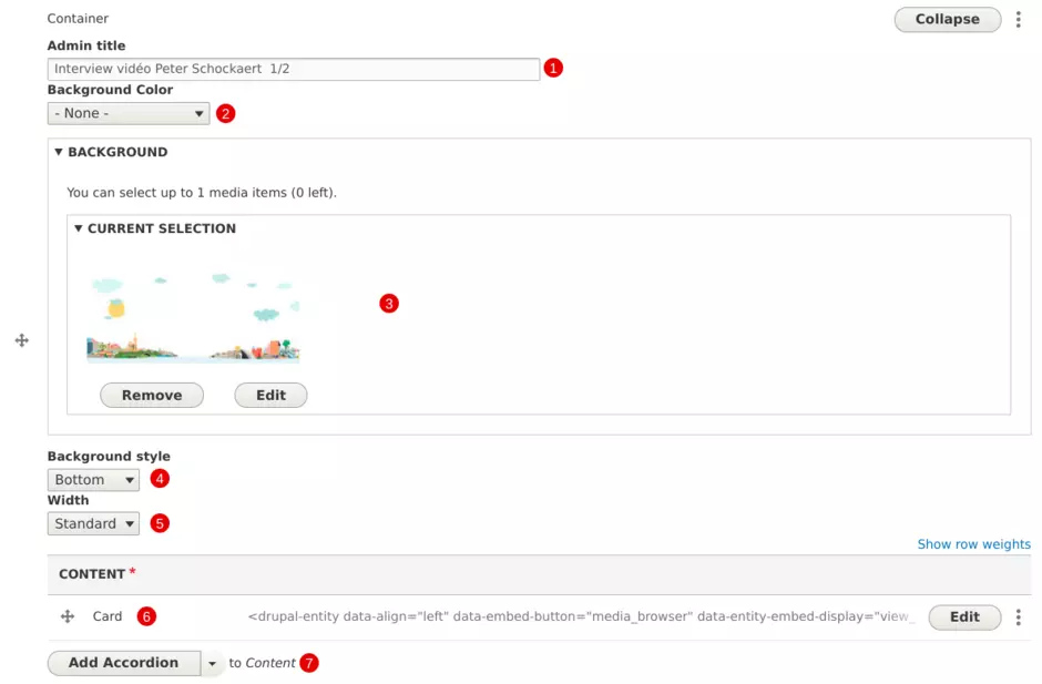
| Field | Description |
|---|---|
| 1 - Admin title | Used only in the backoffice |
| 2 - Background color | Color behind background image: white or grey |
| 3 - Background image | Add image file |
| 4 - Background style | Choose alignment for background image (top, center, bottom) |
| 5 - Width | Choose spanning for background image (standard or narrow) |
| 6 - Content | Component available in the foreground |
| 6 - Add component |
If needed, additonal components can be displayed choice is restricted to Accordion, Content with aside, Card, Grid, Quote, Text and Tabs |