Preview
Chart with a single series of data.
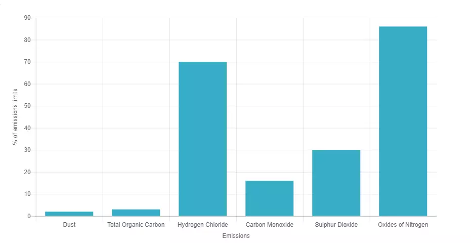
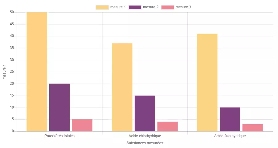
Chart with multiple series of data
Information architecture
Chart is a media that allows user to see an interactive columns chart in an accordion or text.
Design
Chart media component can use any of the Veolia colors.
Typical usage and example
To be used for: Average Daily Emissions, other statistics.
See an example on https://www.veolia.co.uk/shropshire/shropshire/facilities-services/energy-waste/battlefield-emissions-air-data
How to create it
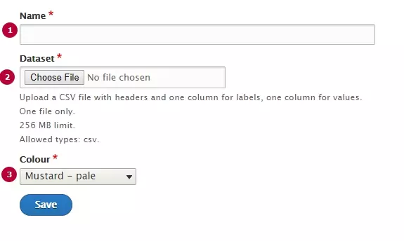
| Field | Description |
|---|---|
| 1 - Name | Used only in the backoffice |
| 2 - Dataset | CSV file with chart's data. See format canvas below |
| 3 - Colour | Chose a color for all Chart's columns |
Rows and columns can be managed by Dataset file, file format is CSV.
Specific canvas has to be used. Download the one corresponding to your need and use as a source.
Note: in case of multiple data series, on the first row of CSV the first cell is used to name the abscissa and the last cell is used to name the ordinate.