Preview
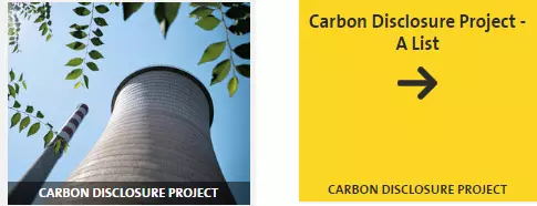
An image gallery item preview - common view and view on hover.
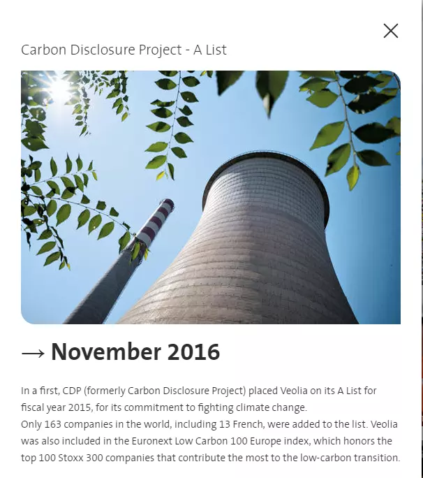
Gallery item popin preview - opens on click
Information architecture
Image or video can be set for the Gallery item.
Gallery item media is used only for Images/Videos listings.
Thumbnail image with a caption can be set for the Gallery item.
Drupal supports image formats jpg/gif/png. Animated gifs are supported.
Design
Gallery popup opens on a click.
Colored background or thumbnail image will be displayed on mouse hover/unhover for Image gallery.
Type of gallery item terms can be set for Image gallery item. Terms are used for filters on Images/Videos gallery pages.
How to create it
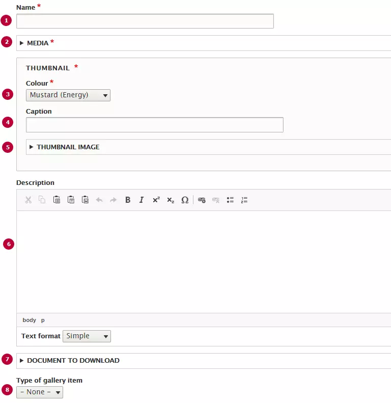
| Field | Description |
|---|---|
| 1 - Name | Title of the gallery item, displayed by default on the listing and on hover. |
| 2 - Media | Image of the gallery item, displayed in the popin and by default on the listing. |
| 3 - Colour | Gallery item's colour, only visible on hover. Allows any colour from Veolia colors |
| 4 - Caption |
Allows to personalize the thumbnail caption on the list items. |
| 5 - Thumbnail image | Image will be displayed as thumbnail of a gallery item |
| 6 - Description | Rich text, displayed in the popup. |
| 7 - Documents to download | Attached documents, displayed in the popup. |
| 8 - Type of gallery item | Types of gallery item can be configured in the taxonomy with same name. Displayed as a filter above the gallery. |