Warning
Showcase Card is a specifc media designed to bring additional information,
and redirect to another content if needed.
It's restricted to Business Case, Market and Solution templates
Preview
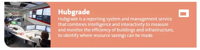
Showcase card media example, default view
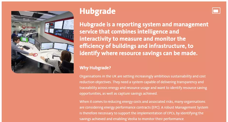
Showcase card media example, display on hover
Information architecture
Showcase cards media allows to display a big amount of data in a compacts block with an image and short introduction preview.
Design
Showcase card component can be added only to the Showcase Cards component
Long description is displaying on mouse over.
How to create it
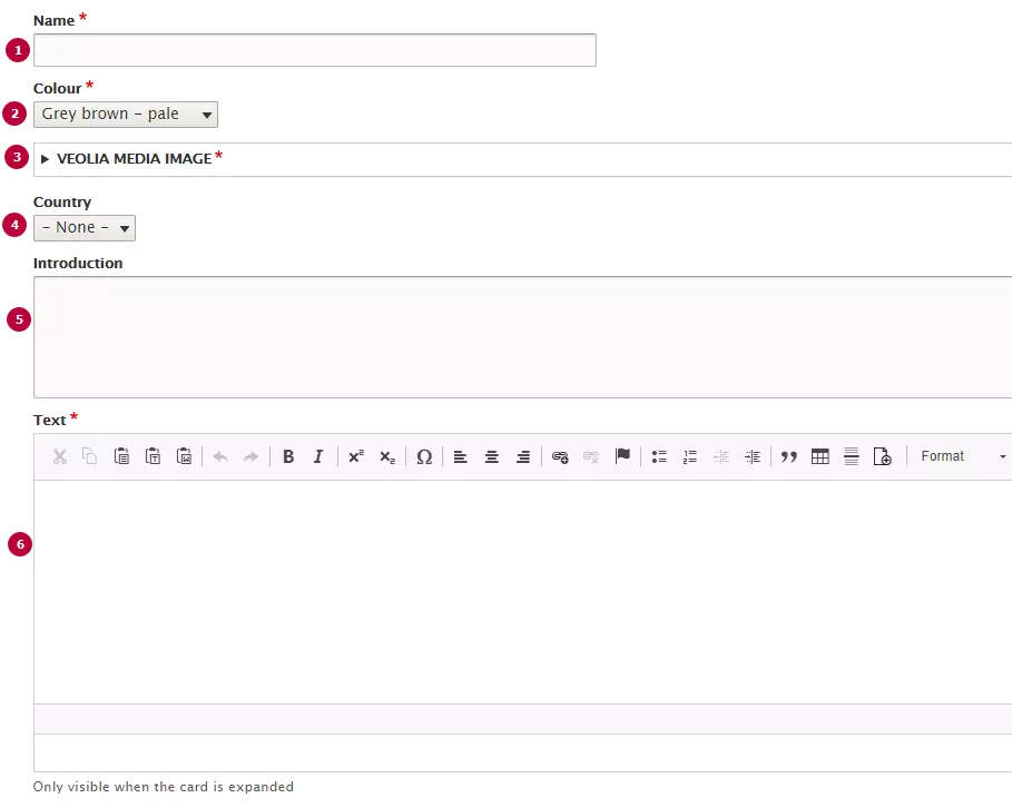
| Field | Description |
|---|---|
| 1 - Name | Used only in the backoffice |
| 2 - Colour | Colour of the Card. Can use any of Veolia color |
| 3 - Image | Thumbnail image. Recommended image dimension is 260x260px. |
| 4 - Country | Options from Country taxonomy. Name of country displays as laybel of the card if it set |
| 5 - Introduction | Introduction text, displayes on Showcase card preview. Becomes bolder on hover |
| 6 - Text | Long text of showcase card. Can include text styles and headers |