The Card component offers a flexible way to showcase content with a customizable design. Discover how you can enhance your layout with text, media, and interactive elements
How to edit in the back office?
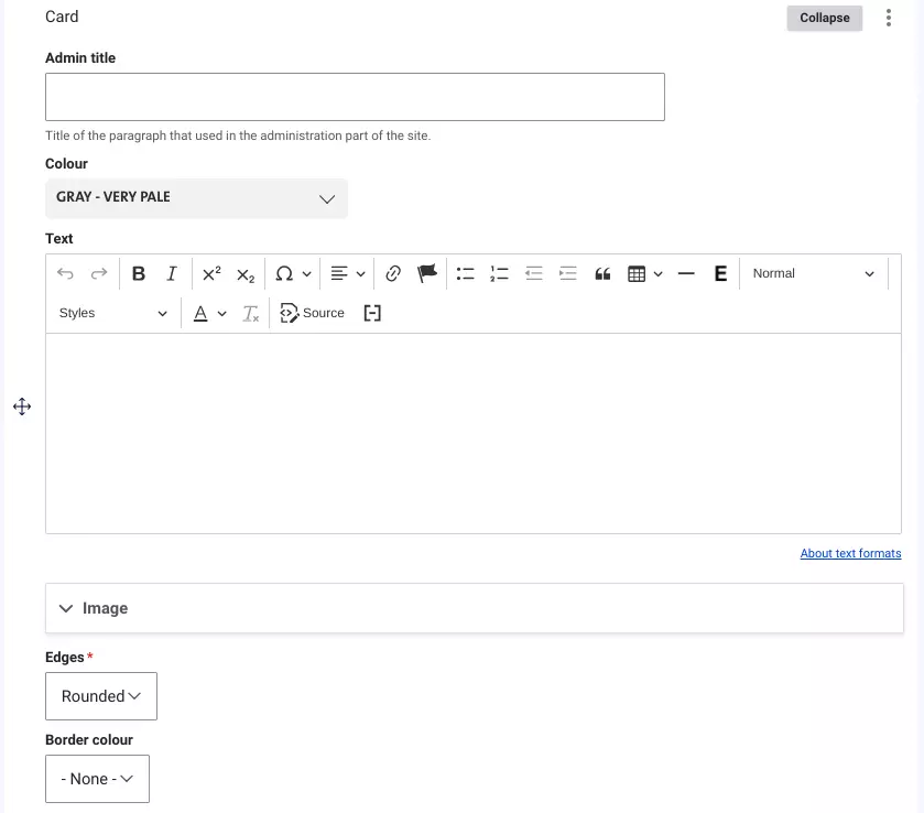
The Card component allows you to present content in a structured, visually appealing format. It supports not only text but also various media, including images, documents, videos, and CTA buttons, giving you flexibility to enrich your content.
Cards always use the full width of the page and can be added to a Grid, Content with Aside, or Tabs paragraph. You can customize the card's appearance by choosing from Veolia's color palette, and it can feature either rounded or square corners with an optional white border.
Examples:
Card in one column
Add content here...
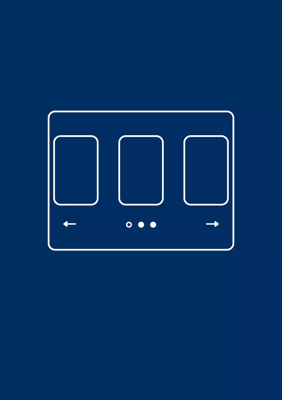
Cards in two columns


Cards in three columns
Add content here...
Add content here...
Add the content...
Image card

Image card 1

Image card 2

Image card 3
Image card


Activity card

This is an activity card

This is an activity card

This is an activity card

This is an activity card