This procedure will guide you in creating and using the Story Panel component, designed to add unique graphic structure with a background (color or image) and a foreground for standard components.
Editing a "Story Panel" Component in the Back Office involves two steps:
Step 1 : Access and edit the Story Panel
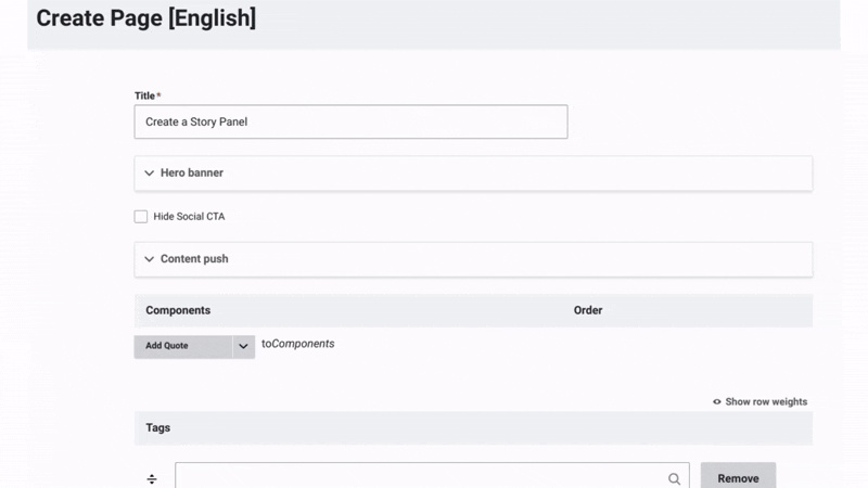
Once the title, hero banner, and content push of the page have been updated, you can start working on the content by adding a Story Panel.
Add a Story Panel:
- Click on the arrow next to "Add Quote to Component."
- From the dropdown menu, select "Add Story Panel."
- Assign an admin title to the container, visible only in the back office. This makes it easier to organize and manage future edits.
Customize Your Panel Story:
- Add a title and customize it (adjust the title color and alignment). Then, anchor the title text to add a unique identifier to it, allowing direct linking or smooth navigation to that specific section.
- Choose a background color from the dropdown menu or upload a media file from the media library or your local files.
Step 2 : Content of the Story panel
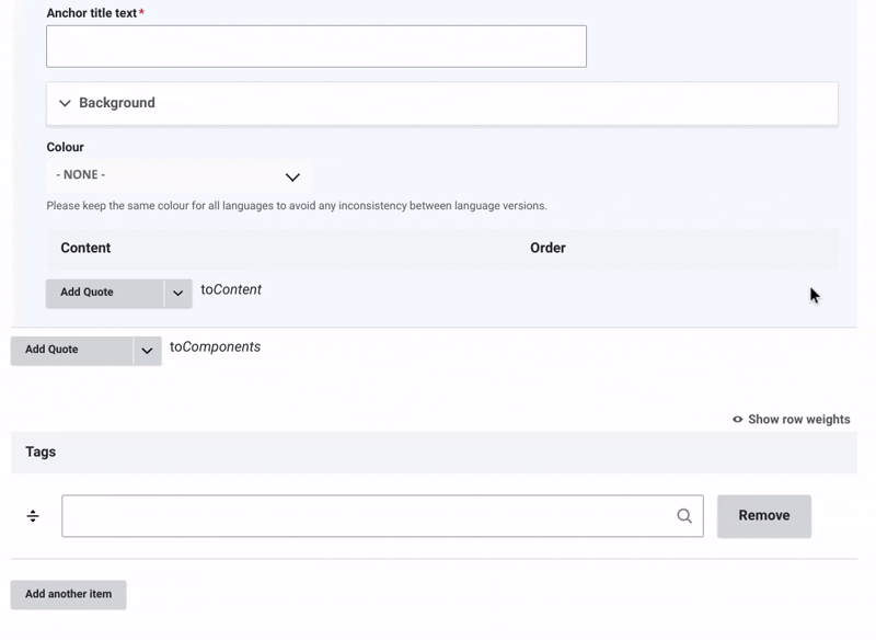
Add Content to the Story Panel:
- Click on the arrow next to "Add Quote to Content."
- From the dropdown menu, choose the type of element you want to add.
Content Options for the Story Panel:
- Text: Add customizable text with font styles, sizes, and media like CTAs, images, or videos.
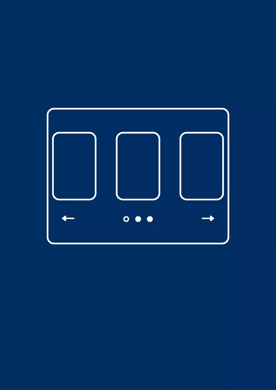
- Carosel: Create a dynamic slider to display multiple items, such as images or content cards.
- Accordion: Organize content with collapsible sections.
- Grid: Use a grid layout for creative content structuring. Explore grid features here.
- Content with Aside: Create two-column layouts for side-by-side content. Learn more about setting up Content with Aside here.
- Embed: External content like videos, maps, or media using an Iframe or Integration code.
- Tab: Add interactive sections for easy navigation.
Save Your Changes and Change the status to "Published".
Example:
You can add cards to your story panel to visually display key information.


Enhance your story panel by adding Tabs.
Found here how to edit a Tab in the back office !